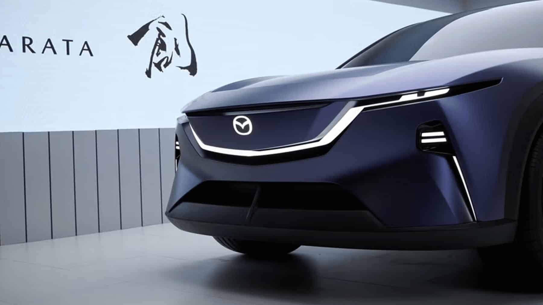
Mazda changed its logo again in 2025, and it’s now appearing on some of its new vehicles. It’s a bit of a subtle change, to be honest, but I don’t like it.
First revealed at the Japan Mobility Show in 2025, the new logo has started appearing in different divisions. One of the most recent was Mazda of Mexico, which had the new logo on vehicles as of May 2026.
The new logo is boring. It’s flat. It’s following the latest trend of automakers going flat, simple, and monochromatic. If you ask Mazda, it’s “modern” and “refined.” The story behind the new logo sounds a bit better; however, with Mazda claiming it captures the spirit of the 1997 logo, the “M” looks like a pair of “soaring wings.”
Wrote Mazda: “This embodies the Company’s commitment to continuous self-reform and dynamic, unceasing growth. It demonstrates the evolution of the brand toward the next generation.”
If you look at Mazda’s logo history, you can see the life drained out of it. In the 1920s, the logo appeared as a circle with sharp edges, meant to look like the blade of a cork crusher. The letters “T” for Toyo and “C” for Cork are inside. I personally like this one; it looks like a confusing corn maze, very intricate and bold. The 1928 logo was a bit of a miss visually, a red circle with two lines inside, meant to be the Japanese character “工,” for “manufacturing.” ‘Cause that’s interesting.
The 1931 logo was pretty cool, featuring “Mazda” written out with three black diamonds of the Mitsubishi Corporation behind it. Looks like something you’d see on a racing jacket. In 1936, Mazda switched to three wing-like lines, with the three “Ms” it created representing Mazda, Motor, and Manufacture. It was meant to look like a flowing river, the wings symbolizing speed and agility. A bit much for its namesake at the time, three-wheeled trucks, but still neat. The 1959 symbol looks like an M&M, featuring a lower case “m” in the center of a black circle. This is supposed to represent wings again, but I don’t see it.
Seeega. Sorry, I mean Maaaazda. The 1975 logo featured all lower-case letters, spelling out Mazda in light blue. It looked fast and corporate, reminding me of Sega’s logo in a way. My favorite one came in 1991, the “Ahura Mazda” symbol that can be found on NA Miatas. It reminds me of a flame, a target… It has a lot of movement. To Mazda, this symbol means sun, halo, and wings. Again. The company wrote: “It expresses Mazda’s aspiration to create vehicles that are human-friendly and enriching.”
This is where it gets boring. From 1997 until 2026, you get 203984234 versions of the same exact symbol: a circle with the letter “M’ in the middle that’s meant to look like soaring wings. Meant to represent dynamic growth, it sorta defeated the purpose by remaining the same for two decades now. All that really changes is the texture and sharpness. By 2025, they were calling it “refined,” but it’s just the same thing with no shading or texture.
Why are car logos boring now?
Automakers are not the only companies that have fallen victim to this boring logo trend. Two years ago, a Redditor pondered: “I’ve noticed that in the past few years, corporate logos have become a lot more basic-looking after they’re redesigned. Some examples are Pringles, Pepsi, Xbox, and Mastercard. The new logos do things like remove text from images, and remove lighting effects to give a ‘flat’ look rather than an embossed look.”
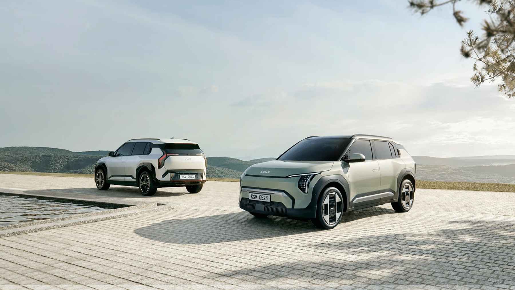
This has become a pretty common observation on Reddit. There have been people wondering this for years. Why are all the logos boring? Volkswagen went from a 3D blue sphere to a thin, flat blue circle. The bottom “W” doesn’t touch the bottom of the circle, which really bothers me. Kia was also brought up. Once easily recognizable inside of an oval, it’s now sort of confusing, with some feeling as though it looks like “AN” and some “KN.”
A lot of graphic designers weighed in on the matter. It looks like you can blame our phones.
It started off as a trend for tech companies. Flat, simple designs worked better for an app icon logo. Our phones have smaller screens and can’t fit as much detail. It’s better to use a very simple logo, which can work on something as small as a phone app or as large as a billboard. This set the trend, and other companies followed, hoping to look modern and future-proof. Any company that stuck with a more colorful or textured logo started to look dated.
It makes sense, but I don’t like it. Well, it matches the state of car design, too. Simple, emotionless, and featureless, with skinny LED lights. Everything is just becoming boring. Remember when TVs and computers were see-through? Now I know how boomers feel. Well, at least we’re getting the Volkswagen ID.Buzz back. Mazda, want to up the ante with your rotary-powered sports car? We need some whimsy before it starts to feel like we’re stuck in a Cybertruck factory.